Discover
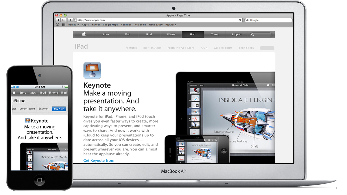
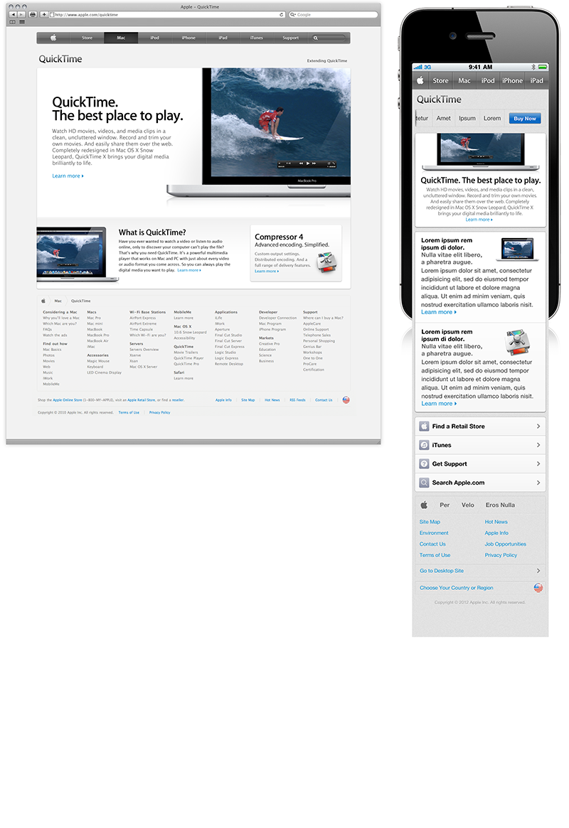
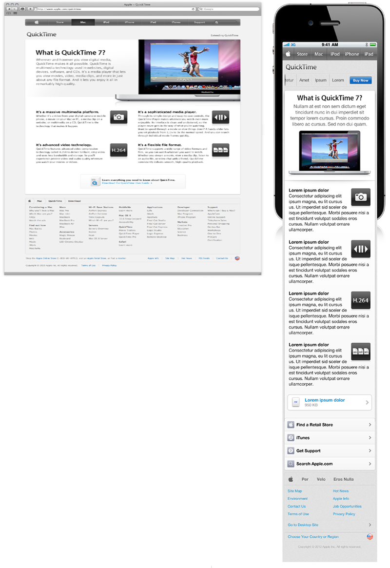
Apple.com mobile version was lacking brand identity and more importantly not aligning with Apple's business goals and vision. It was very important to Apple's Sr. executives that the mobile website version replicates the look and free that of the desktop and maintain the same user experience when users engage with apple products. Keeping a good user experience is part of Apple's success among their products. Senior executive's demanded that customers have the same user experience no matter what device they were using to view Apple's products and services the website.
Challenge
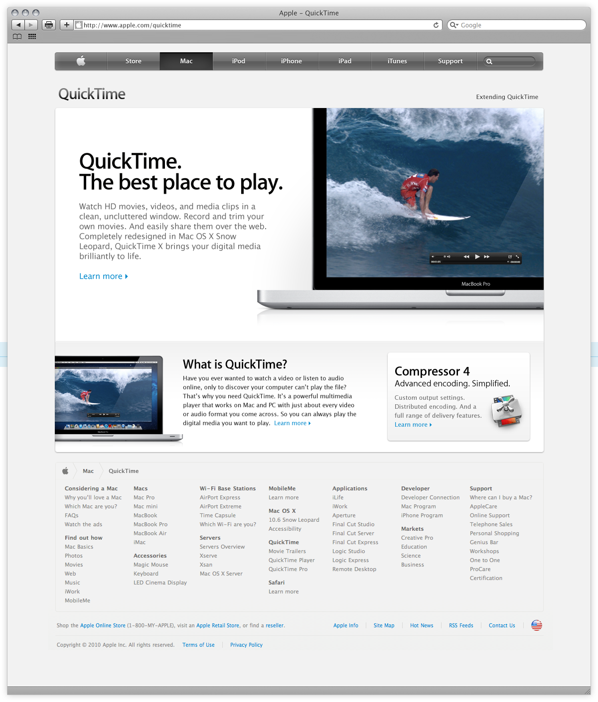
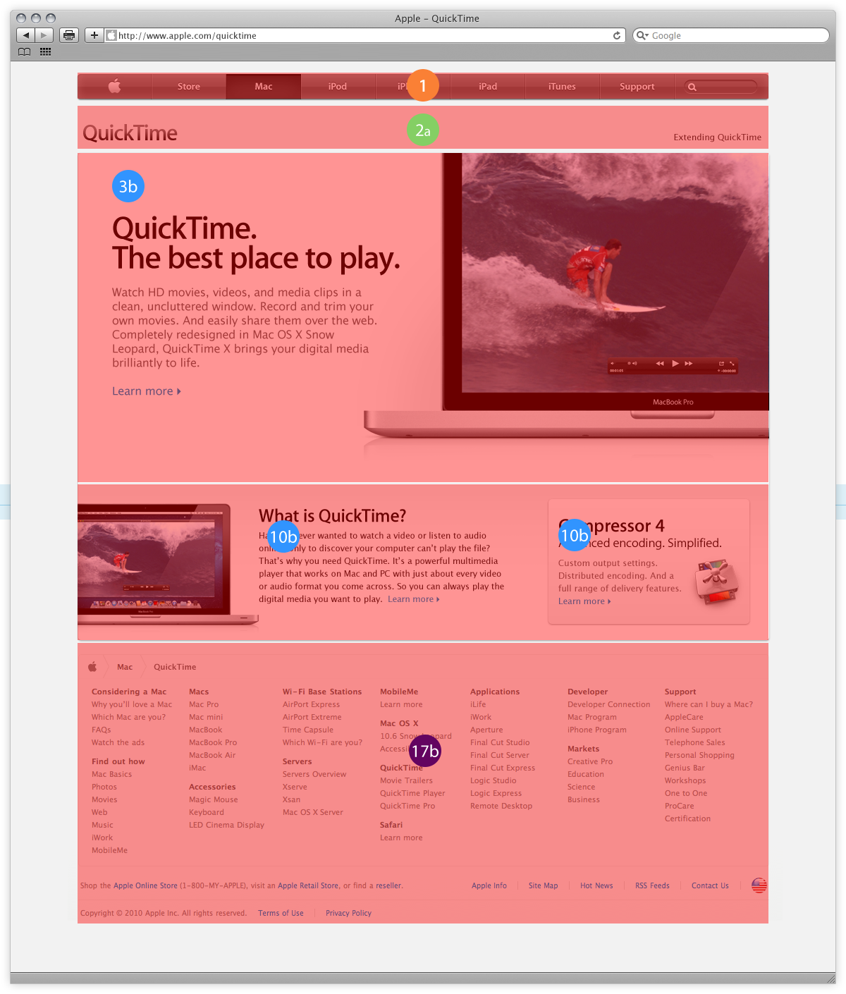
With over 10,000 pages represented on the desktop site, I was as part of a core team to document and establish patterns. Each documented pattern had to be approved and determined if a new pattern had to be created for a mobile format. Apple was very particular that the "user experience's" is the same as that of the desktop.
Solution
Once the entire site was cloned we had generated and established over a hundred different design patterns. From here we labeled the patterns and created mobile versions of the patterns in which we could recreate the mobile site page by page documented below.
© SANDEEP HUNDAL 2025.